My roles: UX/UI Designer, Copy writer, WordPress implementer
Kiwi is a hairdresser who specialises in dreadlocks. Her business has been booming, but mainly by word of mouth, and she wanted to have a place that people who are considering getting this hairstyle can find and contact her.
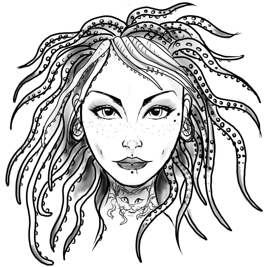
Some time previous, Kiwi had a friend make a stylized drawing of her face, hair and (very unique) tattoos, which Kiwi wanted to use as a logo. I figured it was too detailed (and non-opaque) for that, but could work as a nice background image.
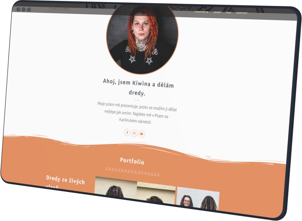
During the first interview I found out that most of the websites local dreadlock artists have are, for lack of a better word, horrid. This resulted in Kiwi’s primary adjectives for her desired site to be “clean, clear, ideally black-and-white”. When shown a few websites that aren’t B&W but still look clean, she added “fun, informal; I’m trying to work for them, not make money off of them.”
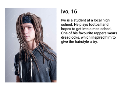
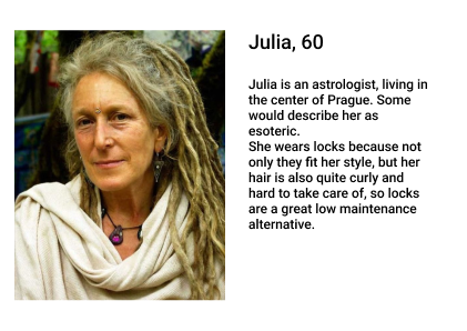
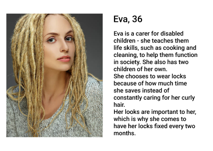
User personas
Who we're working for
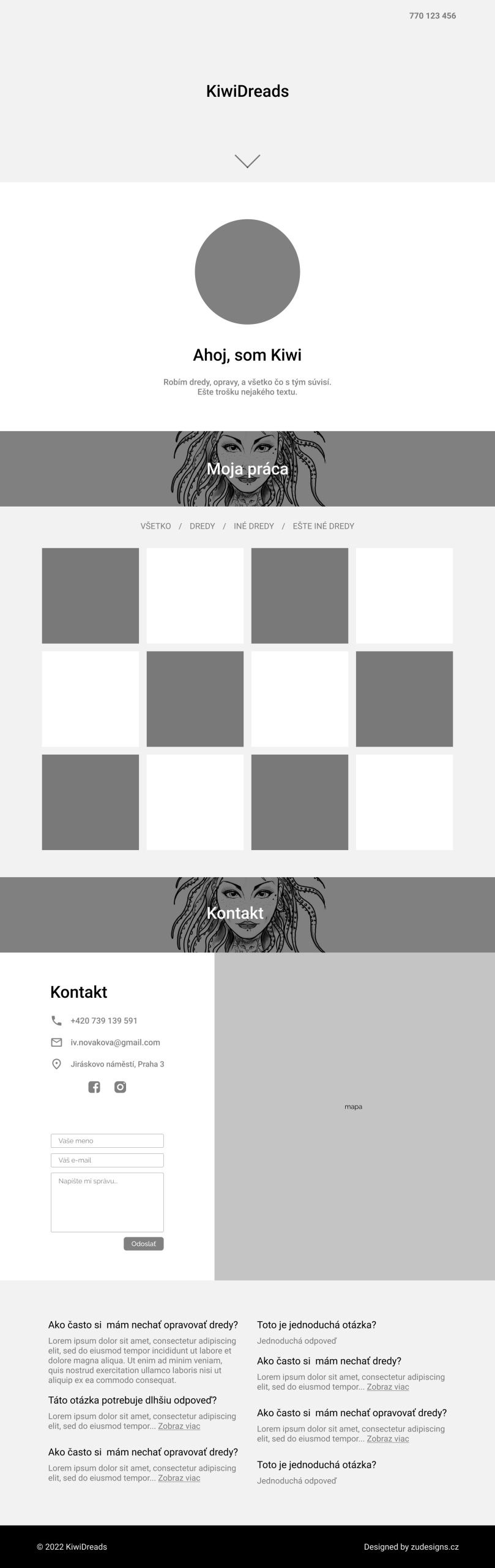
Wireframes
Iterations
Having done competition research and Kiwi’s intentions with the website, I could safely say that a one-pager would be more than enough. In terms of sections we needed a portfolio section with categories and descriptions, as well as a contact, pricelist, FAQ, and an “about me” section. These section were designed modularly, playling with different layouts of the content, mix-and-matching them, and tweaking them based on how well they fit together.
During the rounds of user testing, I decided to add a much-requested feature – the price calculator right below the pricelist, as well as regrouping the FAQs to reflect the discussed topics.
After two months of having the site up, I reached out to the client, who reported having a lot more new customers, and many of them praising her clear and easy-to-navigate website.
Oleo Script
Yaldevi
Lessons learned
What I got out of it
User testing is a lot less scary than it looks once you dive into it.
Convincing the client that their idea is not exactly good and will cost them users (no, each dreadlock category shouldn’t have its own page with a separate gallery) takes a lot of creative effort. I didn’t give in though.
Sometimes, a single color complemented with a few greys is more than enough, especially if the main component of the website are photos.
Also, designing is all well and good, but there is only so much WordPress will allow me to do. Especially for free.
I dived deeply into the workings of WordPress, learned about its structure and how the different plugins work, and also how important it is to take notes because there’s no way you’ll remember where the right header settings are or why you installed a specific plugin some months ago.