white foxyco logo

Web UI Redesign

phone with the product page loaded

Foxyco is a Czech start-up company manufacturing props for flow-artists, owned by three young jugglers. They have only just started selling their products, and since all of the owners have this as a side-hustle, the progress on expanding their market presence has been slow. According to their own words, their website is in an unfinished state and they haven’t gotten around to getting it done.

They place great importance on the prop being easily customizable, since every flow artist treasures the uniqueness of their personality and flow.

When my partner tried to buy one of their bouncy balls via the existing website, it took him multiple attempts to manage this – the overall UX was just horrible. I got in touch with the company owners and offered them a nearly pro-bono redesign, which they happily accepted.

As a flow artist myself, I have a unique insight into what a user of such a site might expect. It was also an opportunity to learn how to properly use Figma on a real-life project.

Resources & constraints

What we started with

Fredoka One

Raleway

The owners have previously hired a designer who came up with their logo, colours, and fonts.
They utilised this and created the original version of their website.

According to the owners’ wishes, the redesign should only include quick and effective fixes, but record bigger ideas for later.
The site should be made in WordPress, which I hadn’t worked with before, so this was an added challenge.

Stakeholders

Who wants what

While brainstorming, I came up with a mind map of the various stakeholders, their motivations and actions.

This included the flow artists themselves, who teach each other, go to festivals and events and spread knowledge about good props via the word of mouth, as well as their families, who are looking for a good present.

Site testing

What's wrong

I then moved on to testing and playing with the existing site, noting down any dark patterns, usability issues and site malfunctions. Thanks to my testing background, I found A LOT.

For my own design, I tried to pick out the ones that would have the biggest impact and would still (I hoped) be easy to fix.

When talking to the owners, they realized that I criticised pretty much everything that they put in themselves, without the designer.  They were glad to have hired another professional.

Moodboards

What it should feel like

The company prides itself in making day props (the buugengs and fans), as well as LED poi – to be played with at night.

Using my experience with the flow community, I put together a moodboard for each of these different uses.

Design

What came out of it

Click to enlarge!

Design

What came out of it

long screenshot of the website's home page. The sections include an introduction of the company, click-throughs to the products with product images on the background.

Tap to enlarge!

Ideas

What would be cool

While designing, I got some ideas that would almost definitely be hard to implement, but decided to record them anyways.

a sketch - the four product menu items have their distinct shapes as background

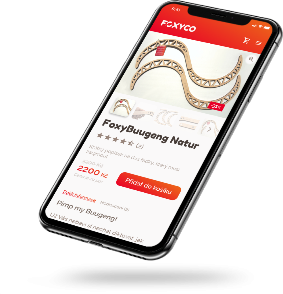
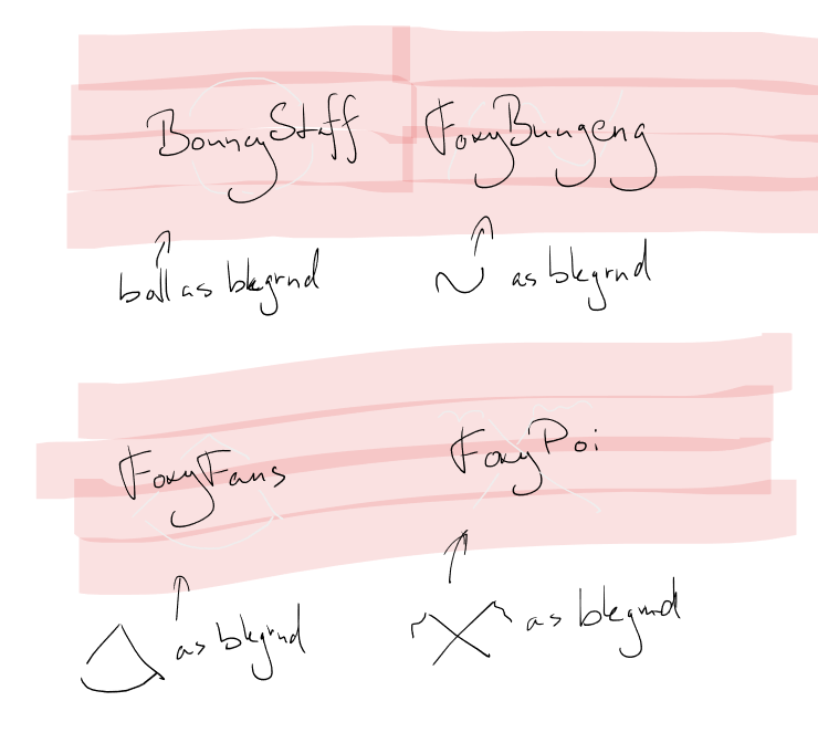
Shapes helping product recognition

Using the well-known shapes of the flow toys as the background on their respective menu items to help with recognition.

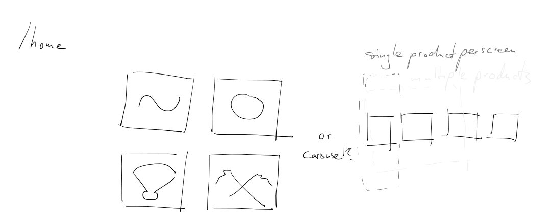
Different home page menus

Having the home as either a gallery of categories (buugengs, balls, fans, and poi) or a carousel of the same, in order to show off all of the products.

a sketch of the S-shaped buugeng, split horizontally into four parts, each one should be customized in a different way

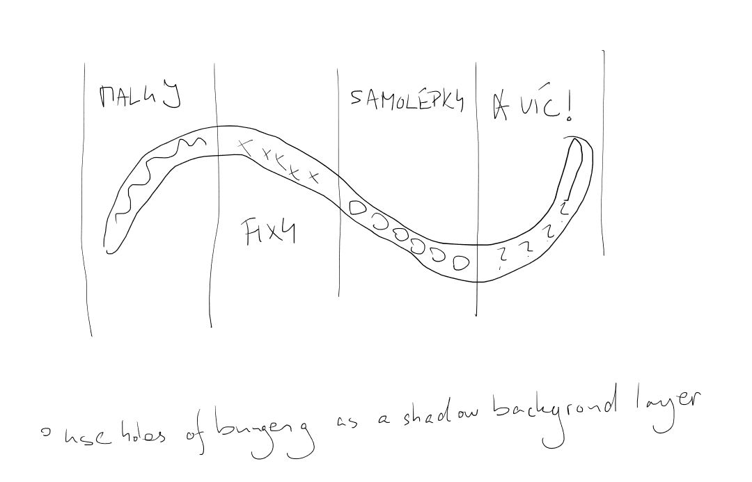
Examples of customization

A four-part split of an image of a buugeng, where each part is customized in a different way (using paints, markers, stickers, and more), resulting in a better idea of what the customer can do to the toy to make it their own.

Lessons learned

What I got out of it

This was my first real-world project.

While I am aware that the process could be very much improved upon (such as focusing more on user-testing, more frequent iteration with the owners, creating more mockups before designing), there was an incredible amount of things I learned through it.

I learned to use Figma beyond just the rectangles and ellipses. Also that I really shouldn’t dive head-first into redesigning when I haven’t scoured the original site properly (I suppose everyone makes this mistake at least once, am I right?).

The project also encouraged me to look into WordPress, since that’s what most businesses use nowadays, and it’s definitely a valuable skill.

It was great to design something where I was part of the focus group – it really helped me empathise with the user.